
Working closely with The Cathedral of St John the Baptist in Norwich, I tackled redesigning their website to help increase visitor numbers, with a particular focus on navigation as this was highlighted as a key issue in my research.
Existing site analysis and heuristic markup
User testing current site
Card sorting task: considering navigation
Competitor analysis: exploring common themes
Interviews with Cathedral staff and attendees
Design: site map, sketches and wireframes
User testing & iteration
Existing Site Analysis
I began my research by creating a site map, analysing their current site and pinpointing the main problem areas. Exploring each page of the Cathedral website helped me to thoroughly familiarise myself with the current flow and issues at hand.
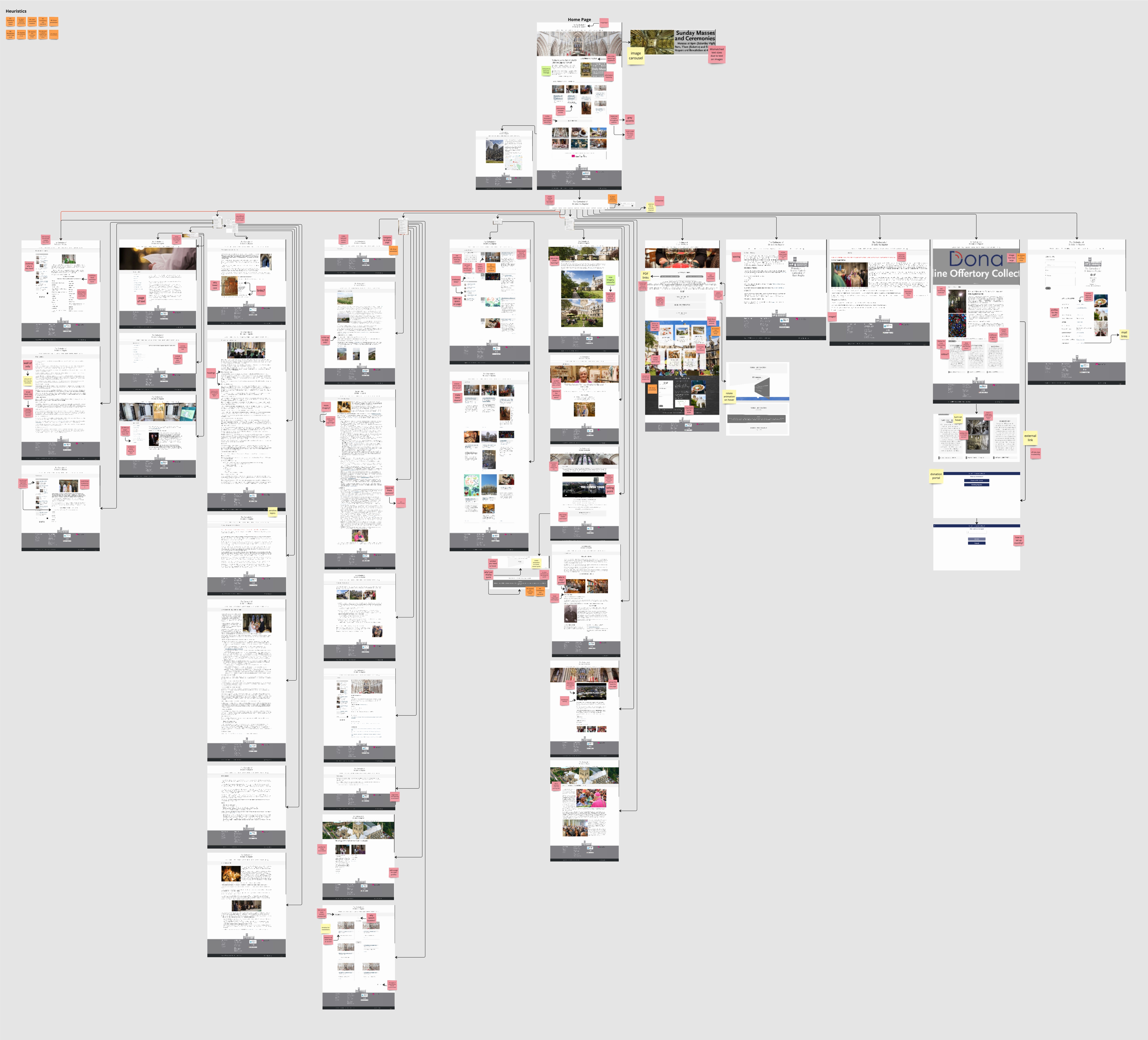
Site map, analysis & heuristic markup
I wrote a set of tasks for each user to run through on the existing Cathedral site, with the plan being to test my redesign with the same tasks later on in the process so that I can quantify my results.

Mapping my user testing insights
Through the testing process I discovered the difficulty users were having with completing tasks due to confusions with navigation, often becoming incredibly frustrated or giving up altogether. From this I decided to look further into the navigation by running a card sorting task.
This was an open card sort, only giving participants the page names and asking them to create their own groups and headings for these groups.
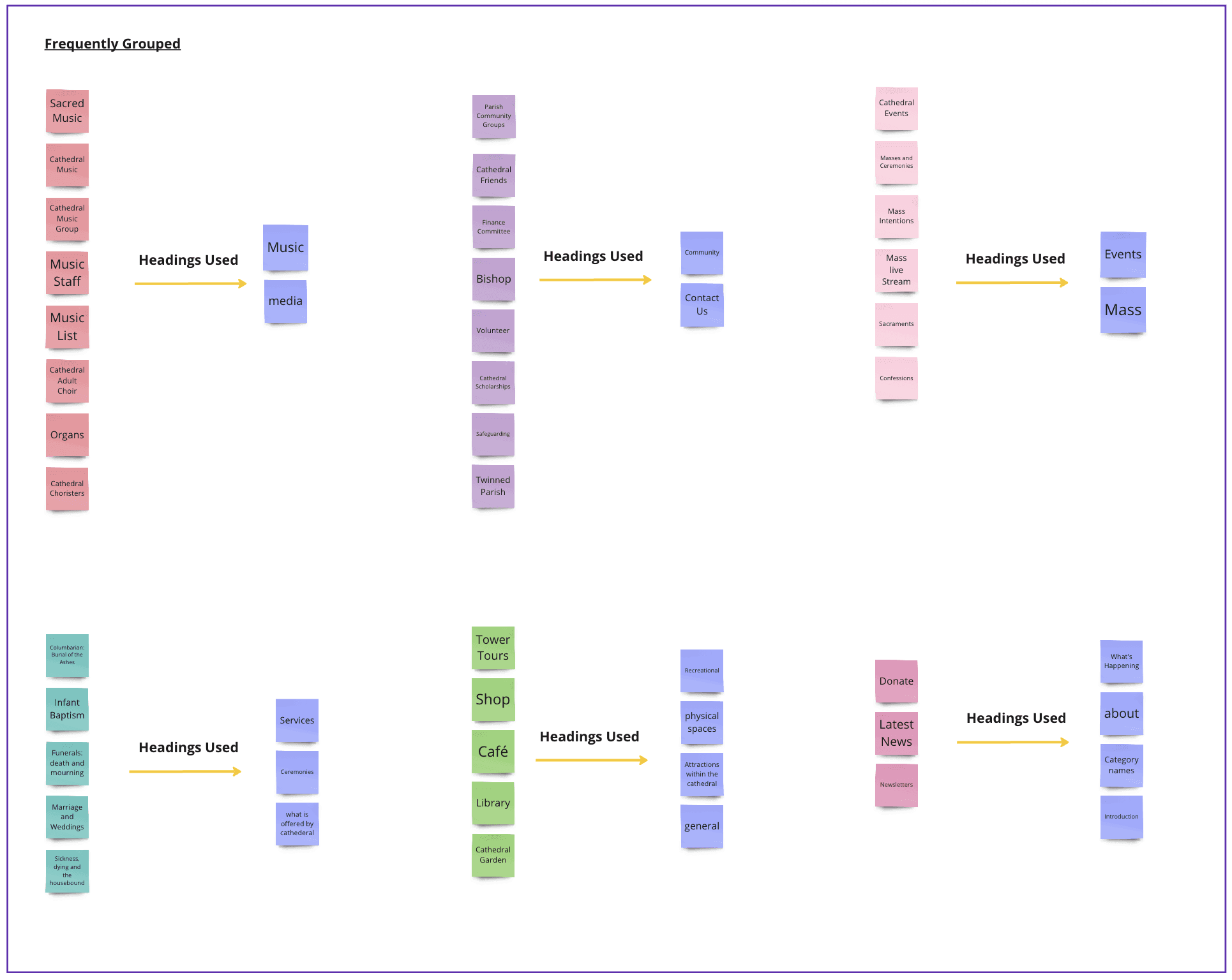
Key takeaways from card sorting task (frequently grouped topics)
I completed an extensive review of other Cathedral and Church websites, particularly focusing on how they design their navigation and visiting pages. I referred back to my competitor research many times in this process when hitting design hurdles, to help spark ideas and solutions.

Section of competitor analysis
I noted some of the successful elements that commonly appeared in my competitor research to help inform my design
Large imagery
Utilising the shapes and patterns of the Cathedral, clean but historic has the most impact
Key info for visiting on Homepage, include navigation to key pages
Simple interactions, don't overcomplicate, consider audience
Hierarchy and legibility of text, clear headings, text split into consumable sections
Essentials in the nav bar and more in menu, hover feedback for nav
Donation button visible on all pages
Scannable timetables for services
Using what I had learned through user testing and card sorting I created initial navigation grouping, which then developed throughout the testing and iterating process.
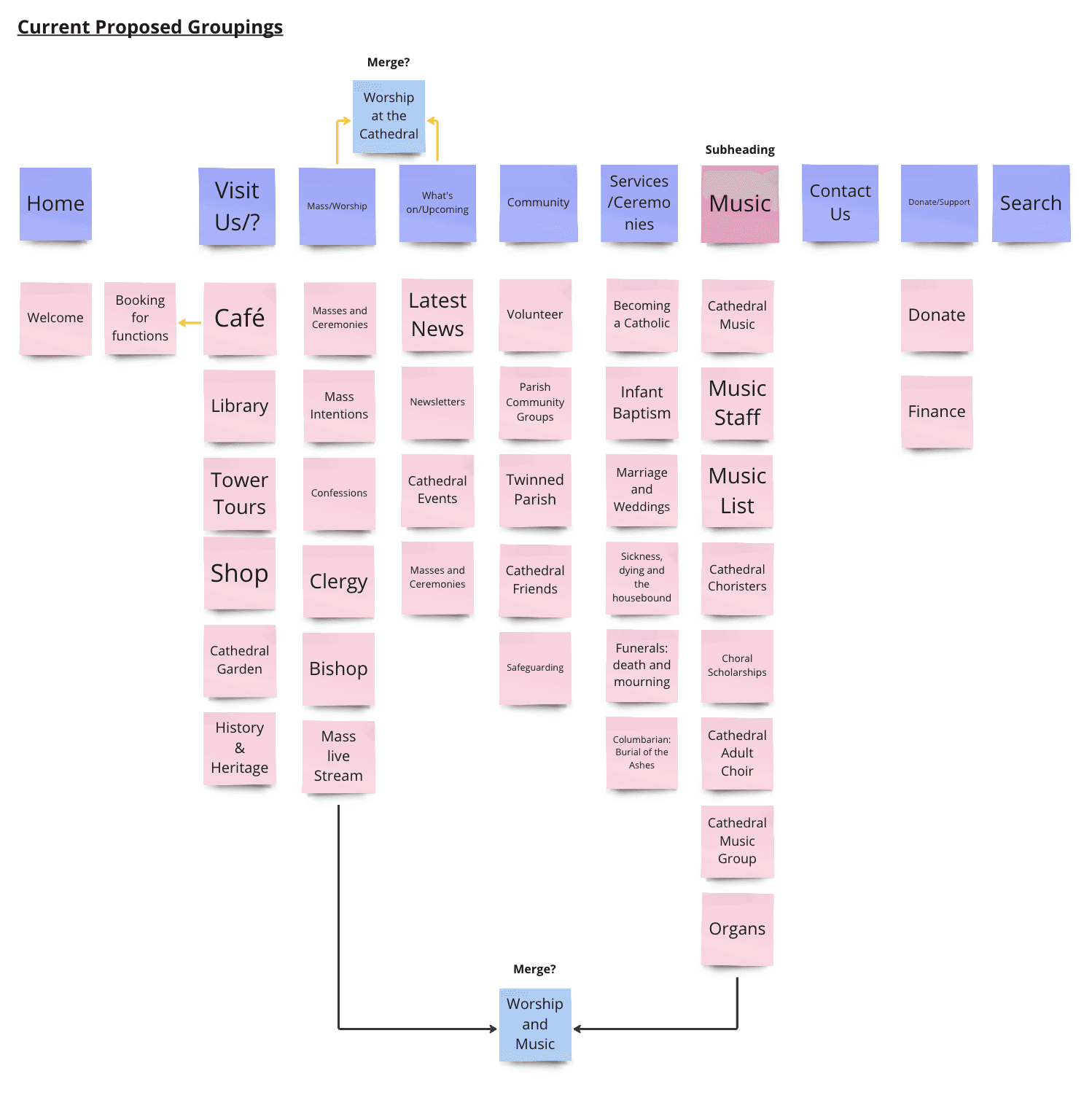
Proposed navigation
I developed this further to then create a site map before I began the design process

Site Map
I started by sketching some rough ideas that had generated through my competitor research

Initial sketches

Created in Figma

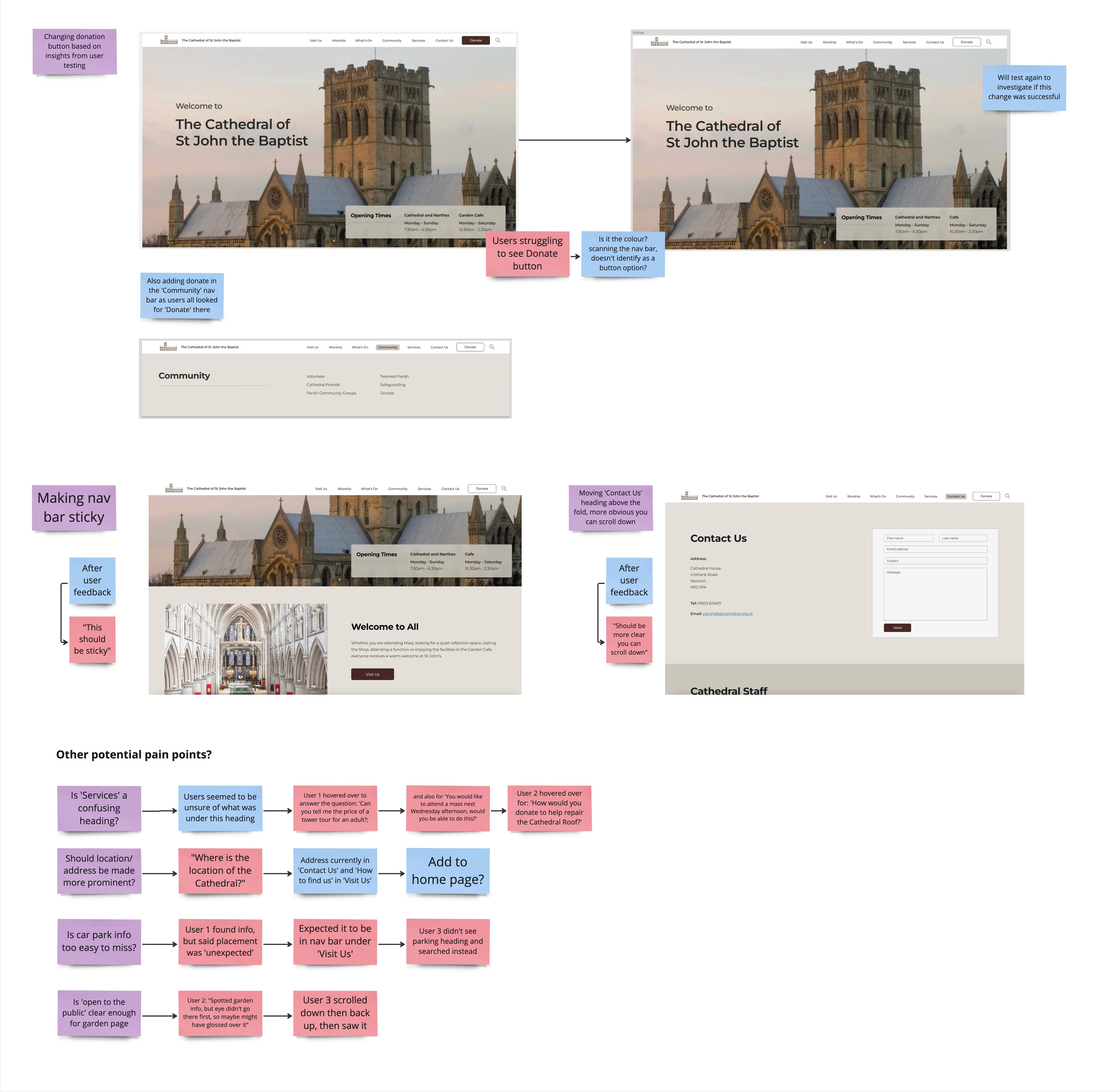
Unexpected pain point: users were missing the 'Donate' button

How many clicks does it take the user to complete the task?

Missing important information such as opening times
‘Welcome to all’ hidden in paragraph
Where to go if you want to visit? Why visit?
‘Visiting Us’ hidden at bottom of page, not in nav bar, users struggled to find it
'Visiting Us' only has parking info
Highlighting opening times
‘Welcome to All’, focal point
Visit Us button at top of page
Key navigation on Homepage
Promoting Tower Tours, USP
'Help Support our Cathedral'

Visiting information scattered
Café opening times difficult to find, under ‘Narthex’ - unclear what this is
Most visiting information under ‘Learning’ confused users
Emphasising welcome to everyone
Plan your visit - key info
Main visiting areas highlighted
Info broken down into consumable sections

Hierarchy issues
Key info outdated and unclear
How to book?
A one of a kind experience - USP
Displaying positive reviews
Highlighting price and dates
Easy booking

Information not scannable
Users confused by timetable
News on the side, overwhelming, just need the latest newsletter
Link to latest newsletter at top
Broken down
Scannable information

Images not relevant
Not personal - users said they would find it too intimidating to contact
New photography of staff adds a personal element
Use of peaked archways, the shapes of the Cathedral

Donation link hidden in large section of text
Images hidden, flip and appear on hover
Hierarchy, use of language
Clear button for donation
Showing goals and images

Unexpected results
Timeline?
Search looks for key words
Clear display

Headings: Parish, Learning and Narthex cause confusion
Most important visiting info under Learning
No café page, under Narthex
Hover doesn’t line up with heading
Headings and sections initially based on Card Sort
Tested and iterated to ensure easy navigation
Larger text, broken into sections, hover feedback

Sofia Durnford
Portfolio